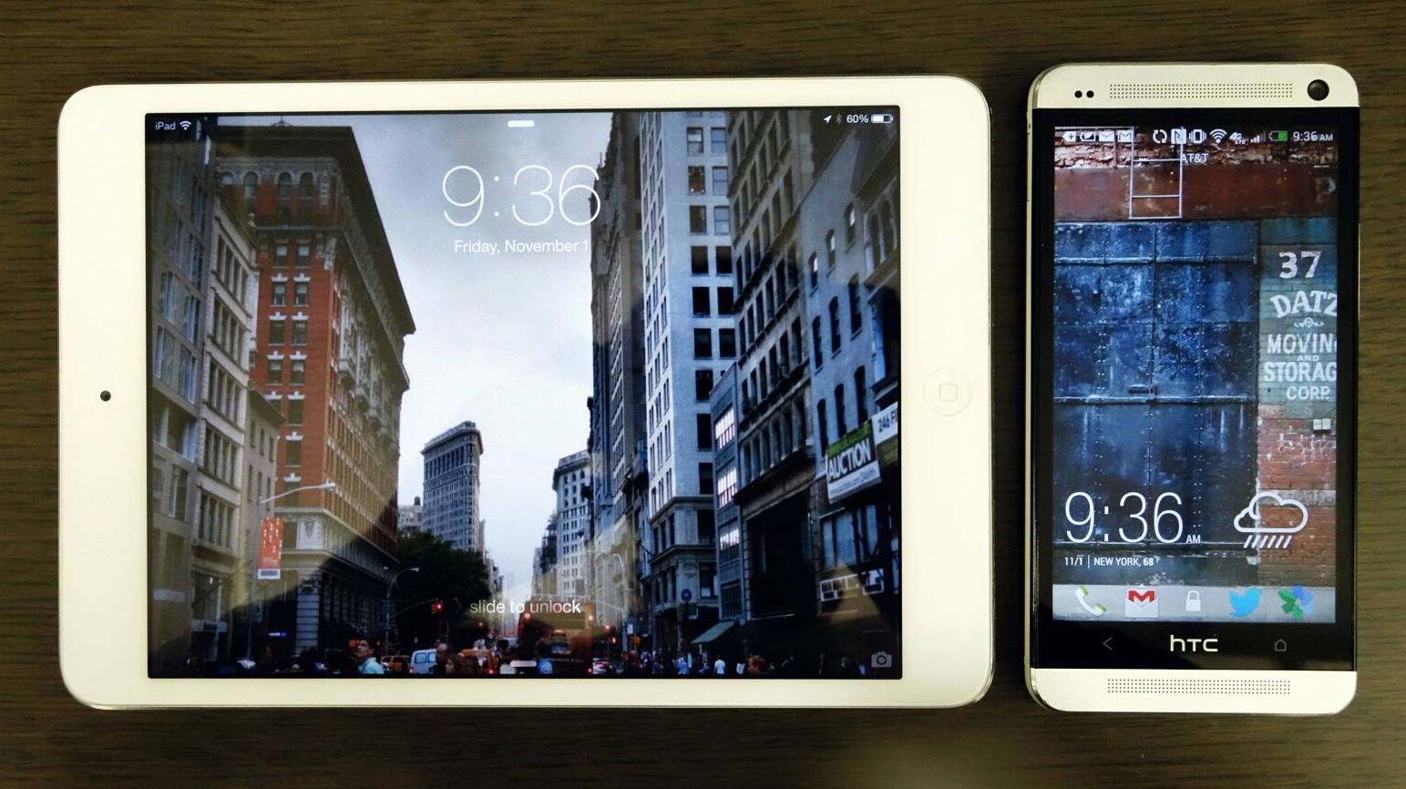

For the time being “designer” could be anyone responsible for designing something digital-potentially web, an app, products etc. My classification is important as much as the sentiment. On a daily basis I’m using both my phone and tablet intermixed with my MacBook Pro retina. The ecosystem for the most part plays nicely with each other thanks to the cloud and that most apps I use are on all platforms. As I go back and forth I try to keep an eye on how the different systems take on the same interactions differently and which one’s are similar. I also like from a design thinking perspective comparing. The same app in the different environments. A designer needs to keep up with best practices. Best practices aren’t just on one platform.
Personally my system of using Android for my phone and iOS for a tablet works really well. It’s what I would recommend that others do as I don’t think it’s a great idea to go Android tablet. I think there’s a long way for those devices to come close to an iPad or iPad mini. So that’s the catch, a lot of designers are unwilling to change from iOS for their phone to Android which is too bad. I’ve become a better designer because I have learned to see what the best of both systems offers (and worst practices). While my comparison is subjective in that I am not comparing two mobile devices or two tablet devices together, but one of each, this review does offer a general working knowledge of both systems.
As good as android is, it’s not perfect-or rather my HTC one isn’t perfect. As I write the first draft of this on my iPad mini I’m using IA Writer. I couldn’t imagine using my HTC One keyboard for a long focused writing. IA writer has one of the best mobile keyboards I’ve used due to the additional buttons it displays. Comparing that keyboard to HTC isn’t comparable but interesting to compare none the less to show what possible.
After years of downloading every app possible I’ve now tried to simplify my daily flow. In terms of operating system fundament sit doesn’t get more basic than comparing home screens. iOS is basically locked down with basic functionality like creating folders where more than two apps can be put together. On the other hand Android goes much further. On a basic level I can sort apps by download recency and alphabetically along with my custom ordering. On an advanced level I can find apps that modify my home screen in entirely new ways. I’ve recently started using Aviate which I quite love. It took about a day to get used to it taking over my home screen but don’t think I should switch back on. It really enhances the experience of my phone depending on what flow I’m in to. Comparing iOS to Android home screens, iOS doesn’t offer much info where as Android makes it possible to create a personal dashboard that saves taps and makes apps more useful in a system. I commented on twitter a while ago questioning why more Android apps don’t take advantage of widgets. Most are poorly designed but offers a great way of making the app more useful. I use a couple sports widgets to track my teams along with weather. Even looking at how sports widgets display the same info differently is fascinating. None of that is possible on iOS which is too bad.
When I’m not using the actual devices I rely on notifications. In terms of info display I think both systems work well. I don’t think one has a distinct advantage over the other when the info window is expanded. Where iOS falls short is the actual notification comes in. I feel like it overtakes the top of my screen. I can’t close it. Because a lot of apps use some sort of top navigation the alerts tend to cover the buttons which is annoying. The HTC One displays the incoming notifications on the top but doesn’t conflict with my larger screen. I also find that opening the notification window easier on my HTC One. He little iOS tab feels too small to drag. iOS’ advantage is that it will display notification on the screen when off. I miss not having that capability on my HTC One.
Some of the useful apps I use on both devices daily include Twitter (and Tweetbot occasionally on iPad Mini), Spotify, Instagram/Flickr, Wunderlist to keep lists, Pocket and Kindle to read, Google Gmail, Maps and Chrome for basic stuff and Strava to track my biking routes. Each of those apps work on both platforms and a few work nicely with all three platforms including my laptop. The iOS apps that don’t work on both platforms include IA writer and Dark Sky which is too bad along with the magazines I subscribe to. Off the top of my head aside from Aviate I don’t think there’s any apps I use that are only on Android.
Comparing most of those apps on both platforms, some work exactly the same like Wunderlist, some with small aesthetic nav differences like Twiiter while others look drastically different like Strava though maintains the same functionality. Kindle shows the shortfalls of iOS not having a back button compared to Android. If a person is reading a book and wants to view all books, it takes two taps to the same screen that only takes one with Android. Having the capability to compare apps is at the core of why I think designers need to be using platforms. Comparing how a user on twitter goes back and forth is different depending on the device. How someone shares/saves articles using Pocket have interesting nuances. Only using one platform and not the other makes it hard on a designer to learn new design patterns.
Settings is one of those black boxes for a lot of visual designers. The catch is that if you’re a product or ux designer they have to understand settings intimately. If they don’t know this it’s pretty hard to understand the functionality their designing. On a platform level iOS does much better displaying the information while Android to gives more functionality to modify and edit. I have to admit there’s been times when one app’s preferences has taken over on all apps which has been difficult to adjust on Android. I’ve had to spend time on list serves to figure out the bug and how to fix that. I don’t think I’ve ever had that issue win iOS.
I’ve really only scratched the surface as to why a designer needs to be on both (actually all 3 if you include desktop/laptop). The takeaway for me is that by thinking of how the same functionality can be designed differently or the same is extremely helpful. It’s also important to understand why differences exist and designing to those advantages. If you’re not on both platforms it’s extremely hard to know this.