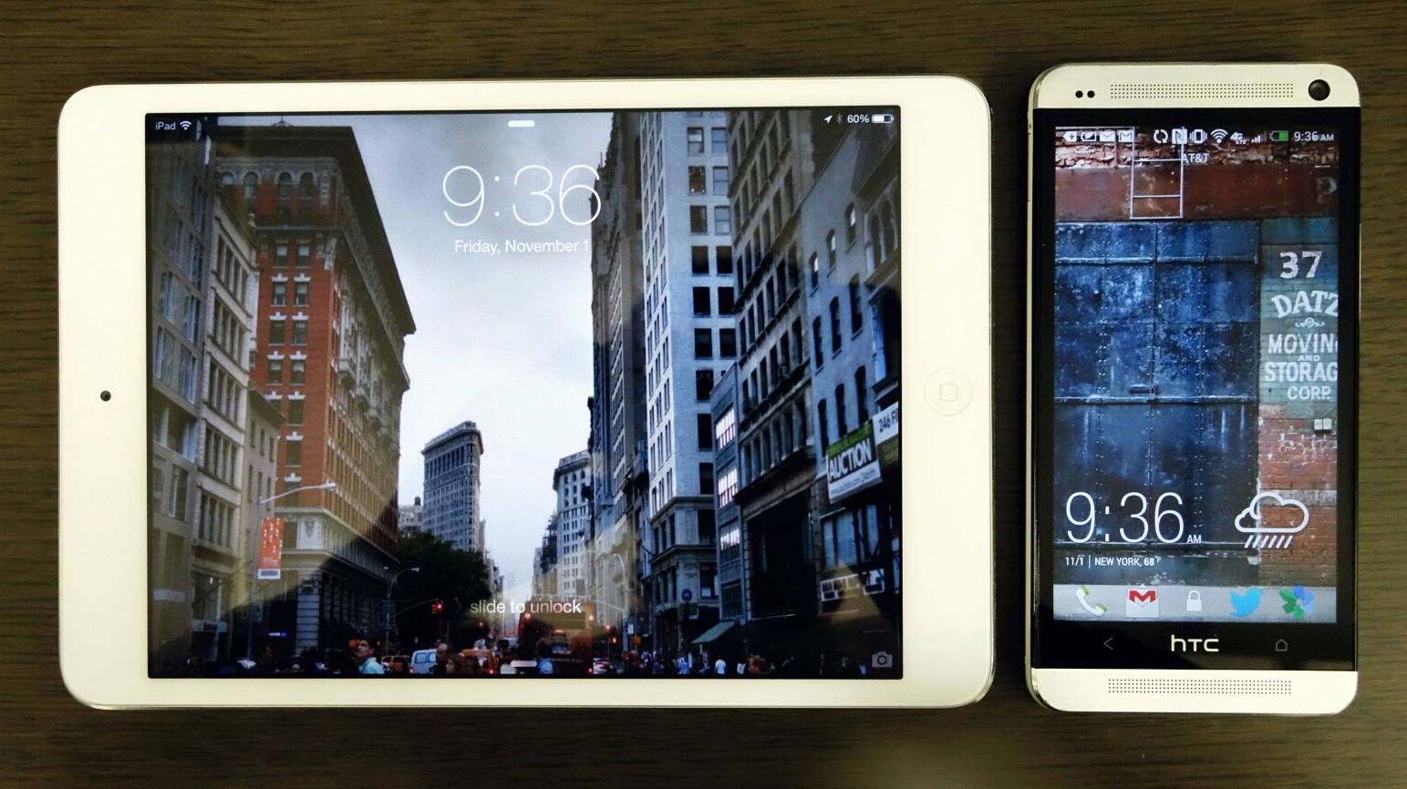
Experimenting, I noticed an efficient use of space both vertically and horizontally. In terms of line height, the short descender space of the ‘g’ and ‘p’ work to keep things compressed while not feeling crushed, thanks in part to the large bowls that keep the characters open. Letters like ‘m’ and ‘w’ adapt well to ‘a’, ‘c’, and ‘e’ and help to keep words tight (in a good way). I also noticed that Clear Sans remained readable whether sitting on a flat background or on busy imagery. The sharp angles of ‘n’ and ‘u’ also made the face stand out for me.
The sensible nature of Clear Sans makes it easy to work with. Aside from the technical attributes, it doesn’t try to feel too “techie” with irrelevant flourishes. Each letter has a nice detail but doesn’t overpower the next letter. If I use words like “efficient” and “practical” a lot here, it’s because they give a good overview of what each character is like viewed up close.
This review of Clear Sans was originally published for Typographica's favorite typefaces of 2013. For quite a few years Typographica has invited an assortment of people to talk about their favorite typeface. This year is no different with the eclectic mix of different typefaces mentioned. Read them at your own pace at typographica.org/features/our-favorite-typefaces-of-2013/